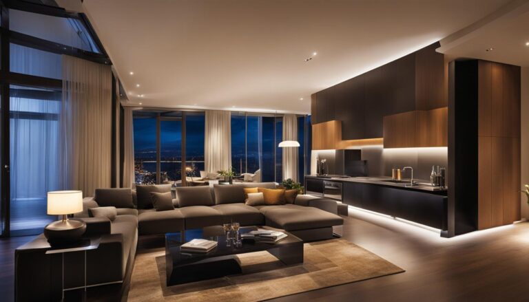
In the world of design, minimalism has emerged as a powerful concept that embraces simplicity, cleanliness, and function. From architecture to interior design, minimalism focuses on stripping away unnecessary details and clutter to create visually appealing and functional spaces. In this article, we will delve into the principles of minimalism in design and explore how they can be applied to achieve stunning minimalist Design Principles.
Key Takeaways:
- Minimalism in design prioritizes simplicity, order, cleanliness, and function.
- Embracing white space, simplicity, and functionality are key aspects of minimalism.
- Minimalist design allows for a larger emphasis on visuals and provides more space for content.
- The 10 principles of minimalism serve as guidelines for creating aesthetically pleasing and functional designs.
- Minimalism extends beyond visual design to user experience (UX) design and product design.
The Benefits of Minimalism in Design
Minimal design has become a popular style in the world of design, and it’s no surprise why. Embracing minimalism offers a range of benefits, from enhancing the visual impact of designs to creating functional and streamlined spaces. Whether you’re styling your home or working on a design project, incorporating minimalist decor strategies can transform your space into a haven of simplicity and elegance.
One of the primary advantages of minimalist design is the emphasis it places on visuals. By embracing simplicity and removing unnecessary clutter, minimalist interiors allow objects and elements to shine in their own right. This approach creates a visually appealing environment that is pleasing to the eye and evokes a sense of calm and serenity.
Functional minimalist interiors go beyond aesthetics. By eliminating excessive ornamentation and focusing on functionality, these designs optimize living spaces for efficiency and purpose. Each element is carefully selected and strategically placed to serve a specific function, resulting in a home that is not only beautiful but also highly practical.
The Power of Simplified Home Styling
One of the key aspects of minimalist decor strategies is simplified home styling. With a minimalist approach, rooms are thoughtfully organized and decluttered to create a sense of order and cleanliness. By removing excess items, every space within the home becomes intentional and purposeful. This not only reduces visual distractions but also allows for easier maintenance and cleaning.
“Minimalism is not the lack of something. It is the perfect amount of something.”
-Nicholas Burroughs-
Minimalist designs also offer practical benefits when it comes to print and digital designs. By using fewer resources, minimalist design is inherently more sustainable and environmentally friendly. Additionally, the simplicity of minimalist designs often translates to cost-effectiveness, making it an attractive option for businesses and individuals alike.
So, whether you’re looking to create a serene living space or streamline your design project, embracing minimalism can unlock a world of benefits. From enhancing visuals to promoting functionality and sustainability, minimalist design strategies offer a harmonious blend of style and purpose.
The Benefits of Minimalism in Design:
- Enhances visual impact
- Promotes functionality and efficiency
- Creates a serene and calming environment
- Reduces visual distractions
- Streamlines maintenance and cleaning
- Sustainability and cost-effectiveness
The 10 Principles of Minimalism in Design
In order to create minimalist and aesthetically pleasing designs, designers adhere to ten fundamental principles of minimalism. These principles serve as a foundation for achieving a harmonious balance between simplicity and functionality in design. Each principle contributes to the overall minimalist aesthetic and enhances the user experience. Let’s explore these principles in detail:
- Embracing white space: White space, or negative space, is the empty space between elements in a design. By strategically incorporating white space, designers create a sense of balance, clarity, and focus.
- Making designs easily understandable: Minimalist designs prioritize clarity and simplicity. By minimizing complexity and eliminating unnecessary elements, designers ensure that users can easily comprehend and navigate through the design.
- Using a limited color palette: Minimalism often emphasizes a limited color scheme, opting for neutral tones and fewer color variations. This restrained approach brings harmony and a sense of sophistication to the design.
- Incorporating simple shapes: Minimalist designs often rely on geometric shapes and clean lines. Simple shapes provide visual clarity and contribute to the overall minimalist aesthetic.
- Focusing on typography: Typography plays a crucial role in minimalist design. Clean and legible fonts with ample white space around them enhance readability and create visual impact.
- Creating a focal point: Minimalist designs often include a focal point, a visually compelling element that draws the viewer’s attention. The focal point adds depth and interest while maintaining the overall minimalist aesthetic.
- Maintaining consistency: Consistency in design elements, such as color, typography, and layout, creates a cohesive and unified visual experience. Consistency fosters intuitive navigation and reinforces the minimalist design approach.
- Using a grid: A grid system provides structure and alignment in minimalist designs. It helps create a sense of organization, order, and balance, resulting in designs that are visually pleasing and harmonious.
- Achieving balance: Balance is critical in minimalist design. Whether it’s symmetrical, asymmetrical, or radial balance, achieving equilibrium ensures that the design feels stable and visually appealing.
- Thinking differently: Minimalist design encourages designers to think outside the box and explore unconventional approaches. This principle promotes innovation, uniqueness, and the avoidance of unnecessary complexity.
Incorporating these ten principles of minimalism in design helps create visually stunning and functional designs that embody the essence of minimalism.
Minimalism in UX Design

Minimalism extends beyond visual design and holds significant importance in user experience (UX) design. The principles of minimalism are applied to eliminate unnecessary clutter from websites and apps, creating a seamless and intuitive user interface. By focusing on functional minimalist interiors, designers enhance user engagement and satisfaction.
Formal visual elements such as typography, color, layout, and photography are used strategically in minimalist UX design. These elements guide users through the interface and convey meaning effectively. Additionally, negative space, or empty areas, is intentionally employed to provide clarity, create breathing room, and emphasize essential content.
“Simplicity is the ultimate sophistication.”
— Leonardo da Vinci
Minimalist UX design prioritizes clutter-free space management, allowing users to navigate the interface effortlessly. By eliminating unnecessary distractions, users can focus on the content that matters most. Functional minimalist interiors enable a seamless user experience by simplifying interactions, reducing cognitive load, and empowering users to achieve their goals efficiently.
Example: Minimalist UX Design in Action
To illustrate the effectiveness and impact of minimalism in UX design, here’s a comparison of a cluttered website versus a minimalist website:
Cluttered Website
| Features | Cluttered Website |
|---|---|
| Layout | Unorganized with excessive elements |
| Color Palette | Multiple contrasting colors |
| Typography | Multiple font styles and sizes |
| Navigation | Complex and confusing menus |
| Content | Overwhelming amount of text and images |
Minimalist Website
| Features | Minimalist Website |
|---|---|
| Layout | Clear and organized with ample white space |
| Color Palette | Subtle and harmonious color scheme |
| Typography | Consistent and legible font choices |
| Navigation | Simple and intuitive menu structure |
| Content | Concise and relevant information |
As can be seen from the comparison, the cluttered website overwhelms users with excessive elements, making it challenging to navigate and find essential information. On the other hand, the minimalist website enhances user experience by providing a clean and intuitive interface, allowing users to focus on the most critical content.
Minimalism in Product Design

When it comes to product design, minimalism goes beyond just visual aesthetics. It revolves around offering users a limited number of options, allowing brands to avoid overwhelming their customers with choices. By simplifying product offerings, brands can create a more intuitive and efficient sales funnel, enhancing the overall user experience.
One of the key aspects of minimalism in product design is the focus on sleek furniture design and compact living solutions. These designs prioritize functionality and practicality, making them ideal for modern living spaces where space is often limited.
Take a look at these examples of minimalist furniture design and compact living solutions:
Whether it’s a minimalist chair with clean lines and minimalistic details, or a space-saving storage solution for compact apartments, these designs exemplify the essence of minimalism. By eliminating unnecessary elements, these products embrace simplicity and functionality, offering hassle-free and aesthetically pleasing solutions for everyday living.
A minimalist approach to product design not only enhances the visual appeal of the product but also ensures that it serves its purpose efficiently. In a world where clutter is abundant, these sleek furniture designs and compact living solutions provide an oasis of simplicity and calmness.
Conclusion
Minimalism design principles serve as the foundation for creating serene and clutter-free spaces. By prioritizing simplicity, order, and functionality, designers can achieve aesthetically pleasing and practical designs that enhance the user experience.
Whether it’s in visual design, user experience design, or product design, embracing the principles of minimalism offers numerous benefits. Minimalist designs improve navigation, allowing users to easily find what they need and accomplish their goals with ease. The emphasis on simplicity also enhances user comprehension, as designs are stripped down to their essential elements, making information more digestible and accessible.
Cost-effectiveness is an added advantage of minimalism. By focusing on clean and streamlined designs, unnecessary resources are eliminated, resulting in more efficient use of materials and reduced production costs.
By embracing minimalism design principles and incorporating them into their work, designers can create innovative and sleek designs that embody the essence of minimalism. With an emphasis on simplicity, order, and functionality, minimalist decor strategies can transform spaces into havens of tranquility and beauty.
Frequently Asked Questions
What are the core design principles of minimalism?
The core design principles of minimalism include simplicity, order, cleanliness, and function.
Why is minimalism a popular design style?
Minimalism allows for a larger emphasis on visuals, provides more space for content, and is easier for viewers to comprehend and navigate.
What are the 10 principles of minimalism in design?
The 10 principles of minimalism in design include white space, understandability, limited color palette, simple shapes, typography, focal point, consistency, grid, balance, and thinking differently.
How does minimalism apply to user experience (UX) design?
Minimalism in UX design aims to eliminate unnecessary content, making it easier for users to navigate and achieve their goals.
How does minimalism impact product design?
Minimalism in product design focuses on offering a limited number of options to avoid overwhelming users and creates more intuitive and efficient sales funnels.


